
INDEX
はじめに
Next.jsにStorybookを導入する方法を学習しました!
その記録を執筆します。
やり方
1. Next.jsを新規で作成する
下記コマンドでNext.jsプロジェクトを作成します
npx create-next-app@latest --ts nextjs結果を確認します
$ npx create-next-app@latest --ts nextjs
√ Would you like to use ESLint? ... No / Yes
√ Would you like to use Tailwind CSS? ... No / Yes
√ Would you like to use `src/` directory? ... No / Yes
√ Would you like to use App Router? (recommended) ... No / Yes
√ Would you like to customize the default import alias (@/*)? ... No / Yes
√ What import alias would you like configured? ... @/*
Creating a new Next.js app in C:\Users\furutan\work\code-lab\nextjs.

Using npm.

Initializing project with template: app-tw


Installing dependencies:
- react
- react-dom
- next

Installing devDependencies:
- typescript
- @types/node
- @types/react
- @types/react-dom
- autoprefixer
- postcss
- tailwindcss
- eslint
- eslint-config-next


added 364 packages, and audited 365 packages in 1m

131 packages are looking for funding
  run `npm fund` for details

found 0 vulnerabilities
Success! Created nextjs at C:\Users\furutan\work\code-lab\nextjs
2. storybookをインストールする
作成したプロジェクトにディレクトリーを移動する
cd nextjs/下記コマンドでstorybookのインストールを開始します
npx storybook init※ 途中下記のような設問が発生します。 Yesで回答します
# インストールしますか?
Would you like to install it?
結果を確認します
$ npx storybook init
╭───────────────────────────────────────────────────────╮
│                                                       │
│   Adding Storybook version 7.6.17 to your project..   │
│                                                       │
╰───────────────────────────────────────────────────────╯
 • Detecting project type. ✓
 • Preparing to install dependencies. ✓


 • Installing dependencies

up to date, audited 365 packages in 2s

131 packages are looking for funding
  run `npm fund` for details

found 0 vulnerabilities
. ✓
 • Adding Storybook support to your "Next" app
  ✔ Getting the correct version of 9 packages
√ We have detected that you're using ESLint. Storybook provides a plugin that gives the best experience with Storybook and helps follow best practices: https://github.com/storybookjs/eslint-plugin-storybook#readme

Would you like to install it? ... yes
    Configuring Storybook ESLint plugin at .eslintrc.json
  ✔ Installing Storybook dependencies
. ✓
 • Preparing to install dependencies. ✓


 • Installing dependencies

up to date, audited 1391 packages in 3s

284 packages are looking for funding
  run `npm fund` for details

found 0 vulnerabilities
. ✓

attention => Storybook now collects completely anonymous telemetry regarding usage.
This information is used to shape Storybook's roadmap and prioritize features.
You can learn more, including how to opt-out if you'd not like to participate in this anonymous program, by visiting the following URL:https://storybook.js.org/telemetry

╭──────────────────────────────────────────────────────────────────────────────╮
│                                                                              │
│   Storybook was successfully installed in your project! 🎉                   │
│   To run Storybook manually, run npm run storybook. CTRL+C to stop.          │
│                                                                              │
│   Wanna know more about Storybook? Check out https://storybook.js.org/       │
│   Having trouble or want to chat? Join us at https://discord.gg/storybook/   │
│                                                                              │
╰──────────────────────────────────────────────────────────────────────────────╯

Running Storybook

> nextjs@0.1.0 storybook
> storybook dev -p 6006 --initial-path=/onboarding --quiet

@storybook/cli v7.6.17

info => Starting manager..
info => Starting preview..
info Using Babel compiler
info Addon-docs: using MDX2
info => Using implicit CSS loaders
info => Using default Webpack5 setup
<i> [webpack-dev-middleware] wait until bundle finished
無事にインストールが出来ていそうです!
3. ローカル環境でStorybookを確認する
下記コマンドでStorybookを起動する
npm run storybook結果を確認します
$ npm run storybook
> nextjs@0.1.0 storybook
> storybook dev -p 6006
@storybook/cli v7.6.17
info => Starting manager..
info => Starting preview..
info Using Babel compiler
info Addon-docs: using MDX2
info => Using implicit CSS loaders
info => Using default Webpack5 setup
<i> [webpack-dev-middleware] wait until bundle finished
<i> [webpack-dev-middleware] wait until bundle finished: /__webpack_hmr
╭───────────────────────────────────────────────────╮
│ │
│ Storybook 7.6.17 for nextjs started │
│ 796 ms for manager and 21 s for preview │
│ │
│ Local: http://localhost:6006/ │
│ On your network: http://172.28.176.1:6006/ │
│ │
╰───────────────────────────────────────────────────╯
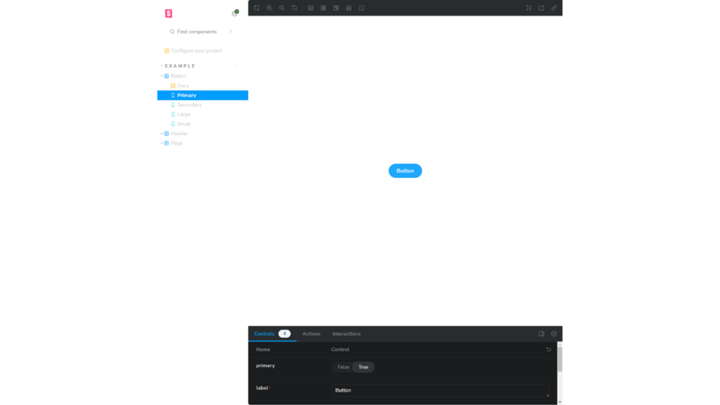
<i> [webpack-dev-middleware] wait until bundle finished: /iframe.html?viewMode=story&id=example-button--primary&onboarding=false&args=
http://localhost:6006/にアクセスすると下記ページが表示される
おまけ
ディレクトリー構成
.
├── .storybook  # Storybookの設定ファイルが格納されているディレクトリです。
│   ├── main.ts  # Storybookのメイン設定ファイル。
│   └── preview.ts  # Storybookのプレビュー画面の設定ファイル。
├── node_modules
├── public
├── src
│   ├── app
│   └── stories  # Storybookのストーリーファイルが格納されているディレクトリ。
│       ├── assets  # 画像などのアセットファイルが格納されているディレクトリ。
│       │   ├── accessibility.png
│       │   ├── accessibility.svg
│       │   ├── addon-library.png
│       │   ├── assets.png
│       │   ├── avif-test-image.avif
│       │   ├── context.png
│       │   ├── discord.svg
│       │   ├── docs.png
│       │   ├── figma-plugin.png
│       │   ├── github.svg
│       │   ├── share.png
│       │   ├── styling.png
│       │   ├── testing.png
│       │   ├── theming.png
│       │   ├── tutorials.svg
│       │   └── youtube.svg
│       ├── button.css  # ボタンコンポーネントに関するCSSファイル。
│       ├── Button.stories.ts  # ボタンコンポーネントに関するStorybookのストーリーファイル。
│       ├── Button.tsx  # ボタンコンポーネントのReactファイル。
│       ├── Configure.mdx  # Storybookの設定に関するドキュメンテーションが記述されたMarkdownファイル。
│       ├── header.css  # ヘッダーコンポーネントに関するCSSファイル。
│       ├── Header.stories.ts  # ヘッダーコンポーネントに関するStorybookのストーリーファイル。
│       ├── Header.tsx  # ヘッダーコンポーネントのReactファイル。
│       ├── page.css  # ページコンポーネントに関するCSSファイル。
│       ├── Page.stories.ts  # ページコンポーネントに関するStorybookのストーリーファイル。
│       └── Page.tsx  # ページコンポーネントのReactファイル。
├── .eslintrc.json
├── .gitignore
├── next-env.d.ts
├── next.config.mjs
├── package-lock.json
├── package.json
├── postcss.config.js
├── README.md
├── tailwind.config.ts
└── tsconfig.json
.stories.ts 拡張子について
- .stories.tsとは?
Reactコンポーネントを文書化し、視覚化するためのファイルです。
これにより、開発者やデザイナーはコンポーネントの異なる状態やプロパティの組み合わせを視覚的に確認できます。
ファイルの中身
.storybook-button {
  font-family: 'Nunito Sans', 'Helvetica Neue', Helvetica, Arial, sans-serif;
  font-weight: 700;
  border: 0;
  border-radius: 3em;
  cursor: pointer;
  display: inline-block;
  line-height: 1;
}
.storybook-button--primary {
  color: white;
  background-color: #1ea7fd;
}
.storybook-button--secondary {
  color: #333;
  background-color: transparent;
  box-shadow: rgba(0, 0, 0, 0.15) 0px 0px 0px 1px inset;
}
.storybook-button--small {
  font-size: 12px;
  padding: 10px 16px;
}
.storybook-button--medium {
  font-size: 14px;
  padding: 11px 20px;
}
.storybook-button--large {
  font-size: 16px;
  padding: 12px 24px;
}
import type { Meta, StoryObj } from '@storybook/react';

import { Button } from './Button';

// More on how to set up stories at: https://storybook.js.org/docs/writing-stories#default-export
const meta = {
  title: 'Example/Button',
  component: Button,
  parameters: {
    // Optional parameter to center the component in the Canvas. More info: https://storybook.js.org/docs/configure/story-layout
    layout: 'centered',
  },
  // This component will have an automatically generated Autodocs entry: https://storybook.js.org/docs/writing-docs/autodocs
  tags: ['autodocs'],
  // More on argTypes: https://storybook.js.org/docs/api/argtypes
  argTypes: {
    backgroundColor: { control: 'color' },
  },
} satisfies Meta<typeof Button>;

export default meta;
type Story = StoryObj<typeof meta>;

// More on writing stories with args: https://storybook.js.org/docs/writing-stories/args
export const Primary: Story = {
  args: {
    primary: true,
    label: 'Button',
  },
};

export const Secondary: Story = {
  args: {
    label: 'Button',
  },
};

export const Large: Story = {
  args: {
    size: 'large',
    label: 'Button',
  },
};

export const Small: Story = {
  args: {
    size: 'small',
    label: 'Button',
  },
};
import React from 'react';
import './button.css';

interface ButtonProps {
  /**
   * Is this the principal call to action on the page?
   */
  primary?: boolean;
  /**
   * What background color to use
   */
  backgroundColor?: string;
  /**
   * How large should the button be?
   */
  size?: 'small' | 'medium' | 'large';
  /**
   * Button contents
   */
  label: string;
  /**
   * Optional click handler
   */
  onClick?: () => void;
}

/**
 * Primary UI component for user interaction
 */
export const Button = ({
  primary = false,
  size = 'medium',
  backgroundColor,
  label,
  ...props
}: ButtonProps) => {
  const mode = primary ? 'storybook-button--primary' : 'storybook-button--secondary';
  return (
    <button
      type="button"
      className={['storybook-button', `storybook-button--${size}`, mode].join(' ')}
      {...props}
    >
      {label}
      <style jsx>{`
        button {
          background-color: ${backgroundColor};
        }
      `}</style>
    </button>
  );
};